
| 일 | 월 | 화 | 수 | 목 | 금 | 토 |
|---|---|---|---|---|---|---|
| 1 | 2 | 3 | 4 | 5 | ||
| 6 | 7 | 8 | 9 | 10 | 11 | 12 |
| 13 | 14 | 15 | 16 | 17 | 18 | 19 |
| 20 | 21 | 22 | 23 | 24 | 25 | 26 |
| 27 | 28 | 29 | 30 |
- 파이썬
- scikit learn
- tableau
- 통계
- 데이터분석준전문가
- pandas
- 딥러닝
- sklearn
- 회귀분석
- Google ML Bootcamp
- 머신러닝
- 태블로
- ML
- 자격증
- pytorch
- Deep Learning Specialization
- IRIS
- 데이터분석
- Python
- r
- SQL
- 데이터 분석
- 코딩테스트
- 데이터 전처리
- 이것이 코딩테스트다
- SQLD
- 이코테
- ADsP
- 시각화
- matplotlib
- Today
- Total
함께하는 데이터 분석
[Python] Matplotlib boxplot 그리기 본문
오늘은 matplotlib을 이용하여
boxplot을 그리는 법을 알아보겠습니다.
라이브러리 불러오기
import matplotlib.pyplot as plt
import seaborn as sns
import numpy as np

plt.rc('font', family = 'AppleGothic') # mac
# plt.rc('font', family = 'Malgun Gothic') # window
plt.rc('font', size = 12)
plt.rc('axes', unicode_minus = False) # -표시 오류 잡아줌
matplotlib은 boxplot을 그릴 때 사용할 것이고
seaborn은 우리가 사용할 데이터를 불러올 때 사용할 것입니다.
numpy는 index를 넣어줄 때 사용하려고 불러왔습니다.
데이터 불러오기
iris = sns.load_dataset("iris")
iris.head()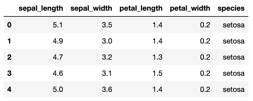
데이터 확인하기
iris.shape

>>> (150, 5)
observation이 150개, column이 5개입니다.
iris.info()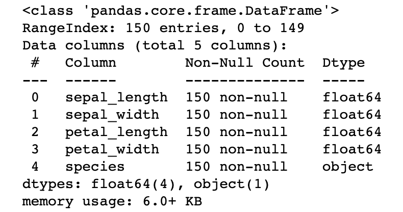
데이터의 정보를 보니 species를 제외한 변수가 수치형인 것을 알 수 있습니다.
따라서 4개의 column에 대한 boxplot을 그리도록 하겠습니다.
iris.describe()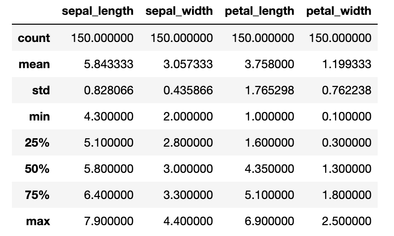
iris 데이터의 요약 통계량입니다.
boxplot을 그리고 비교해보시면 좋을 것 같습니다.
단일 boxplot 그리기
plt.figure(figsize = (10, 5))
plt.boxplot(iris['sepal_length'])
plt.show()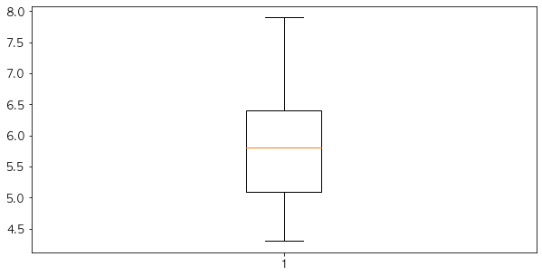
plt.boxplot을 이용하여 iris데이터 중 sepal_length에 대한 boxplot을 그려줬습니다.
boxplot에서 상자 위의 선이 Q3(75%)를 나타내고
아래 선이 Q1(25%), 가운데 주황 선이 Q2(50%) 중위수를 나타냅니다.
이상치(outlier)는 점으로 표시됩니다.
위의 요약 통계량이랑 비교해보면서 확인하시면 좋을 것 같습니다.
여러 개의 boxplot 그리기
plt.figure(figsize = (10, 5))
plt.boxplot([iris['sepal_length'], iris['sepal_width'],\
           iris['petal_length'], iris['petal_width']]) # 리스트로 넣어줌
plt.show()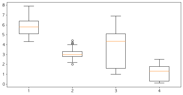
이렇게 여러 개의 boxplot을 그리려면
list로 만들어서 넣어주시면 됩니다.
2번째 데이터인 sepal_width에 점이 보이시죠?
저것이 이상치입니다.
이상치의 기준은
[Q1-whis*(Q3-Q1), Q3+whis*(Q3-Q10)]을 벗어나는 값입니다.
whis의 default값은 1.5입니다.
whis 설정하기
plt.figure(figsize = (10, 5))
plt.boxplot([iris['sepal_length'], iris['sepal_width'],\
           iris['petal_length'], iris['petal_width']],\
            whis = 3) # default = 1.5
plt.show()
whis를 3으로 키우니 이상치의 범위가 넓어져서
sepal_width의 데이터에 이상치로 표시되는 점이 사라진 것을 볼 수 있습니다.
노치 표시하기
plt.figure(figsize = (10, 5))
plt.boxplot([iris['sepal_length'], iris['sepal_width'],\
           iris['petal_length'], iris['petal_width']],\
            whis = 3, notch = True) # 꺽인 부분 중위수에 대한 95% 신뢰구간
plt.show()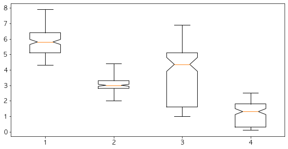
notch = True를 통하여 노치를 추가해줬습니다.
중위수 부분으로 뾰족하게 들어간 것을 볼 수 있죠.
그 부분이 중위수(median)에 대한 95% 신뢰구간입니다.
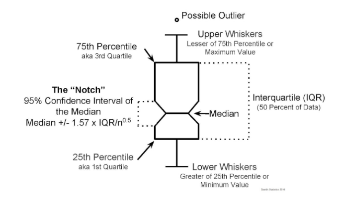
위의 사진을 보시면 더 정확히 이해하실 수 있습니다.
각각의 boxplot label 표시하기
idx = np.arange(1, 5)
labels = ['sepal_length', 'sepal_width', 'petal_length', 'petal_width']

plt.figure(figsize = (10, 5))
plt.boxplot([iris['sepal_length'], iris['sepal_width'],\
           iris['petal_length'], iris['petal_width']],\
            whis = 3, notch = True)
plt.xticks(idx, labels)
plt.show()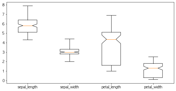
label을 달지 않았을 때 1, 2, 3, 4로 boxplot을 구분해줬습니다.
따라서 label을 달려고 np.arange(1, 5)로 index를 설정했고
labels에 각각의 column을 리스트로 할당한 다음
plt.xticks로 label을 달아줬습니다.
이렇게 각각의 boxplot에 label을 달아주면 알아보기가 훨씬 편합니다.
수평 boxplot 그리기
plt.figure(figsize = (10, 5))
plt.boxplot([iris['sepal_length'], iris['sepal_width'],\
           iris['petal_length'], iris['petal_width']],\
            whis = 3, notch = True, vert = False)
plt.show()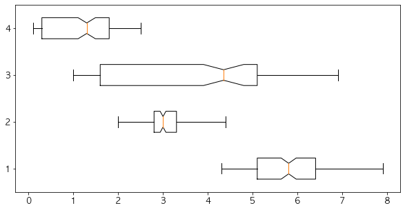
vert = False를 설정하여
수직인 boxplot을 수평으로 그려줬습니다.
이번에도 boxplot에 label을 달아야겠죠?
idx = np.arange(1, 5)
labels = ['sepal_length', 'sepal_width', 'petal_length', 'petal_width']

plt.figure(figsize = (10, 5))
plt.boxplot([iris['sepal_length'], iris['sepal_width'],\
           iris['petal_length'], iris['petal_width']],\
            whis = 3, notch = True, vert = False)
plt.yticks(idx, labels)
plt.show()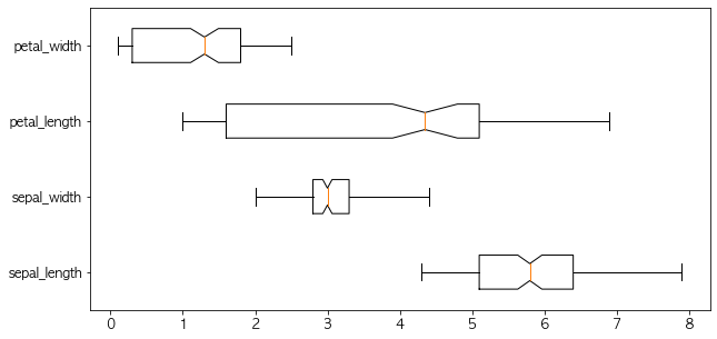
이렇게 plt.yticks를 이용하여 똑같이 설정해주면
label이 달리는 것을 확인할 수 있죠.
마지막으로 title, xlabel, ylabel, rotation을 해주면서 마무리하겠습니다.
종합
idx = np.arange(1, 5)
labels = ['sepal_length', 'sepal_width', 'petal_length', 'petal_width']

plt.figure(figsize = (10, 5))
plt.title("iris 데이터의 boxplot")
plt.xlabel('꽃받침, 꽃잎의 길의 너비')
plt.ylabel('단위 : cm')
plt.boxplot([iris['sepal_length'], iris['sepal_width'],\
           iris['petal_length'], iris['petal_width']],\
            whis = 3, notch = True)
plt.xticks(idx, labels, rotation = 30)
plt.show()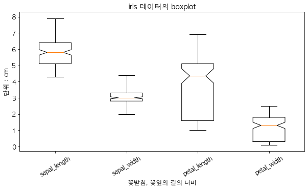
다음에는 violin plot으로 찾아뵐게요!
'데이터분석 공부 > Python' 카테고리의 다른 글
| [Python] Matplotlib 여러 개의 그래프 한번에 그리기 (0) | 2022.04.14 |
|---|---|
| [Python] Matplotlib violinplot 그리기 (0) | 2022.04.12 |
| [Python] Matplotlib 파이 차트 그리기 (0) | 2022.04.09 |
| [Python] Matplotlib 다중 막대그래프 (0) | 2022.04.08 |
| [Python] Matplotlib 누적 막대그래프 (0) | 2022.04.05 |


