
| 일 | 월 | 화 | 수 | 목 | 금 | 토 |
|---|---|---|---|---|---|---|
| 1 | 2 | 3 | 4 | 5 | ||
| 6 | 7 | 8 | 9 | 10 | 11 | 12 |
| 13 | 14 | 15 | 16 | 17 | 18 | 19 |
| 20 | 21 | 22 | 23 | 24 | 25 | 26 |
| 27 | 28 | 29 | 30 |
- 자격증
- 딥러닝
- 시각화
- ML
- 데이터분석
- SQL
- 이코테
- 회귀분석
- IRIS
- ADsP
- 머신러닝
- 파이썬
- 이것이 코딩테스트다
- Python
- Google ML Bootcamp
- 태블로
- sklearn
- 데이터 전처리
- 통계
- Deep Learning Specialization
- r
- pytorch
- 코딩테스트
- matplotlib
- SQLD
- 데이터분석준전문가
- tableau
- 데이터 분석
- scikit learn
- pandas
- Today
- Total
함께하는 데이터 분석
[R] 토픽모델링 본문
안녕하세요. 오늘은 토픽모델링에 대해 알아볼게요.
우선 토픽모델링이란?
토픽 모델링(Topic Modeling)은 전체 내용물에서 일정한 패턴을 발견해 내는
알고리즘 기반 텍스트 마이닝(Text Mining)의 한 형태입니다.
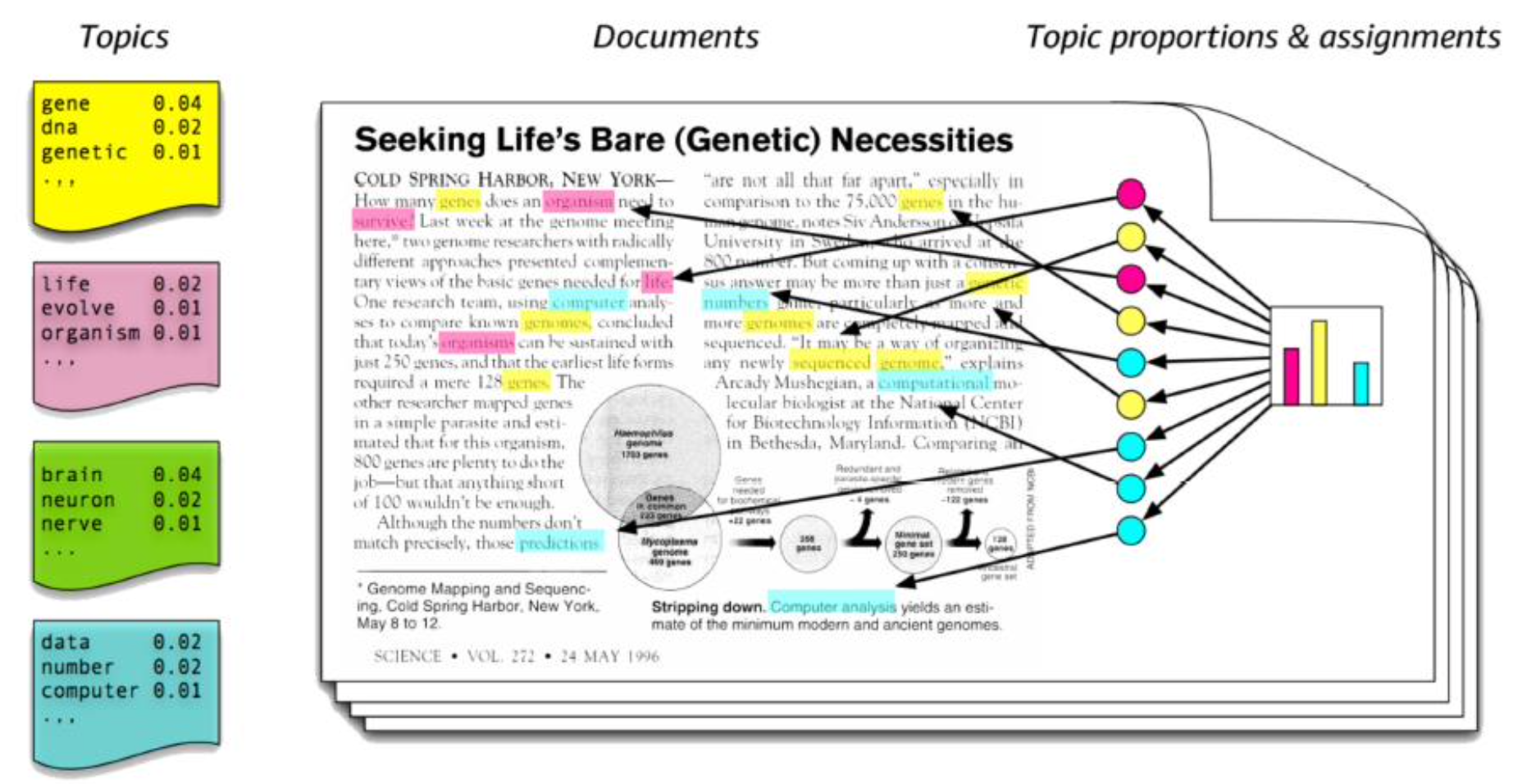
위의 사진을 보면 노란색 박스에 분류된 그룹은 유전과 관련된 단어
핑크색 박스에 분류된 그룹은 생명
초록색 박스는 뇌과학, 하늘색 박스는 컴퓨터과학과 관련됐다고
유추할 수 있습니다!
그렇다면 우리는 R로 구현하여 위와 같이 만들어보겠습니다.
그중 LDA(Latent Dirichlet Allocation)를 활용해볼게요!
# 패키지 설치
install.packages("topicmodels")
install.packages("tidytext")
install.packages("tidyr")
install.packages("ggplot2")
install.packages("dplyr")

# 패키지 실행
library(topicmodels)
library(tidytext)
library(tidyr)
library(ggplot2)
library(dplyr)
우리가 활용할 패키지를 설치와 실행을 시켜줄게요~
data("AssociatedPress")
AssociatedPress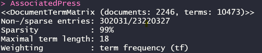
위의 AssociatedPress는 topicmodels 패키지의 내장 data입니다.
이미 전처리를 완료하여 Matrix화 한 data라고 할 수 있습니다.
ap_lda <- LDA(AssociatedPress, k = 3,
              method = "Gibbs",
              control = list(seed = 1234))
ap_lda
3개의 topic으로 분류하고 깁스샘플링 방법을 사용했습니다!
ap_topics <- tidy(ap_lda, matrix = "beta")
ap_topics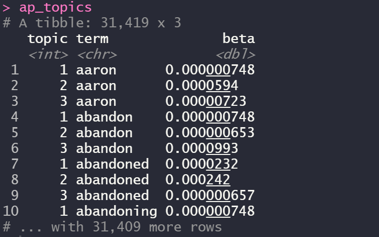
여기서 beta는 확률입니다.
예를 들면 aaron이라는 단어는 topic2에 속할 확률이 가장 높은 것을 볼 수 있죠!
ap_top_terms <- ap_topics %>%
  group_by(topic) %>%
  top_n(10, beta) %>%
  ungroup() %>%
  arrange(topic, -beta)

head(ap_top_terms, 10)
tail(ap_top_terms, 10)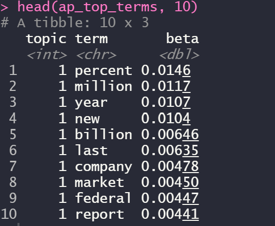
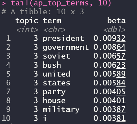
topic1과 topic3을 높은 확률 순서로 내림차순 한 결과입니다!
ap_top_terms %>%
  mutate(term = reorder_within(term, beta, topic)) %>%
  ggplot(aes(term, beta, fill = factor(topic))) +
  geom_col(show.legend = FALSE) +
  facet_wrap(~ topic, scales = "free") +
  coord_flip() +
  scale_x_reordered()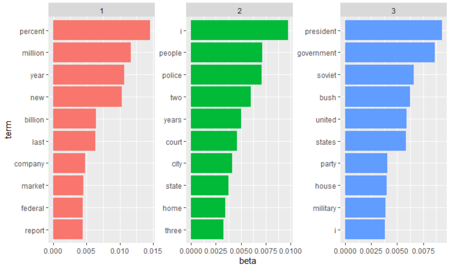
우리가 확인하기 쉽게 ggplot2 패키지를 이용하여 시각화한 결과입니다.
빨간색 그룹은 시장경제와 같은 그룹으로 유추할 수 있고
초록색은 우리 문화, 파란색은 군사정부 등으로 유추할 수 있습니다!
이제는 그룹 간 차이를 분석해볼게요!
beta_spread1 <- ap_topics %>%
  mutate(topic = paste0("topic", topic)) %>%
  spread(topic, beta) %>%
  filter(topic1 > .001 | topic3 > .001) %>%
  mutate(log_ratio = log2(topic3 / topic1))

beta_spread1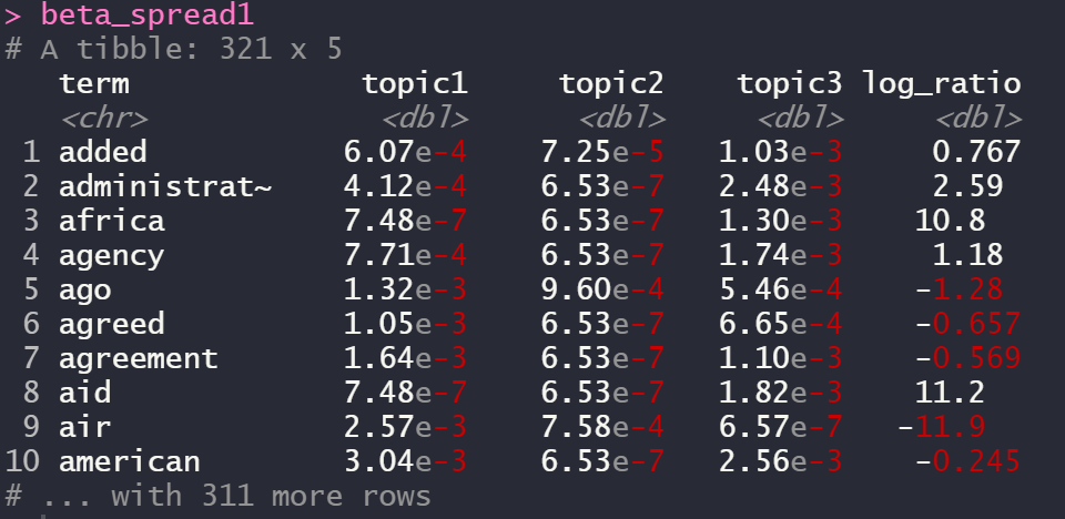
term을 y축 비율을 x축으로 시각화하면
beta_spread1 %>%
  group_by(direction = log_ratio > 0) %>%
  top_n(10, abs(log_ratio)) %>%
  ungroup() %>%
  mutate(term = reorder(term, log_ratio)) %>%
  ggplot(aes(term, log_ratio)) +
  geom_col() +
  labs(y = "Log2 ratio of beta in topic 3 / topic 1") +
  coord_flip()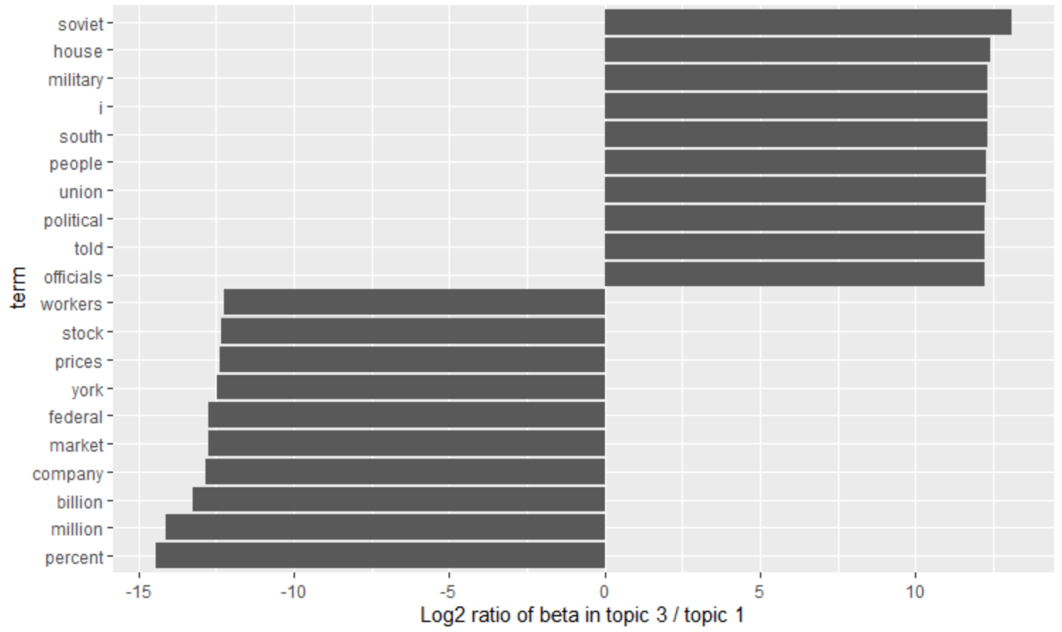
topic1과 topic3 중 그룹 간 차이가 가장 큰 단어들 각각 10개씩입니다.
Copyright
- 비어플 빅데이터 학회
'학회 세션 > 비어플' 카테고리의 다른 글
| [Classification] LDA(선형 판별분석) (0) | 2022.03.26 |
|---|---|
| [Python] IMAGE(2D data) AUGMENTATION (0) | 2022.03.24 |
| [R] 데이터 불균형 해소 (0) | 2022.03.20 |
| 데이터 불균형 해소 (0) | 2022.03.20 |
| [R] 선형회귀를 이용한 회귀분석 (0) | 2022.03.12 |


