
Notice
Recent Posts
Recent Comments
Link
| 일 | 월 | 화 | 수 | 목 | 금 | 토 |
|---|---|---|---|---|---|---|
| 1 | 2 | 3 | ||||
| 4 | 5 | 6 | 7 | 8 | 9 | 10 |
| 11 | 12 | 13 | 14 | 15 | 16 | 17 |
| 18 | 19 | 20 | 21 | 22 | 23 | 24 |
| 25 | 26 | 27 | 28 | 29 | 30 | 31 |
Tags
- Deep Learning Specialization
- SQLD
- 자격증
- 이것이 코딩테스트다
- 파이썬
- sklearn
- Google ML Bootcamp
- 딥러닝
- 데이터 분석
- 데이터분석
- scikit learn
- 이코테
- 태블로
- 머신러닝
- IRIS
- pandas
- 데이터분석준전문가
- matplotlib
- 시각화
- 데이터 전처리
- 통계
- tableau
- 코딩테스트
- SQL
- r
- pytorch
- 회귀분석
- Python
- ML
- ADsP
Archives
- Today
- Total
목록violinplot (1)
함께하는 데이터 분석
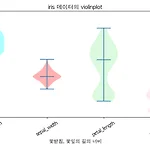 [Python] Matplotlib violinplot 그리기
이번에는 matplotlib을 통하여 violinplot을 그려보겠습니다. 데이터는 boxplot에서 쓴 iris데이터를 사용하겠습니다. 같은 데이터로 그래프를 그리면 차이점을 명확히 느낄 수 있겠죠? 시작해보겠습니다. 라이브러리 불러오기 import matplotlib.pyplot as plt import seaborn as sns import numpy as np plt.rc('font', family = 'AppleGothic') # mac # plt.rc('font', family = 'Malgun Gothic') # window plt.rc('font', size = 12) plt.rc('axes', unicode_minus = False) # -표시 오류 잡아줌 데이터 불러오기 iris = s..
데이터분석 공부/Python
2022. 4. 12. 20:04